Light Reflectance Value (LRV) is a measure of the total amount of visible light reflected by a surface. It is measured on a scale from 0 (absolute black) to 100 (pure white).
LRV is used to calculate the visual contrast between building elements. This calculation is a critical requirement for compliance with BS 8300 and Approved Document M, ensuring that interiors are safe, navigable, and inclusive for all users.
In the UK, providing adequate visual contrast is a legal requirement under the Equality Act 2010 and a building regulation standard under Approved Document M.
It applies to all non-domestic buildings. While it is vital for individuals with visual impairments, clear contrast also aids those with dementia, cognitive impairments, and neurodivergent conditions by making spaces easier to "read" and navigate independently.

Colour and LRV are distinct characteristics. Two surfaces can look completely different in colour (Hue) but reflect the exact same amount of light (LRV).
Colour is subjective. We all experience hue differently, and colour-blindness changes this perception entirely.
LRV is objective. It is a precise scientific measurement. This is why UK regulations use LRV, not colour, to determine if two surfaces are distinguishable.
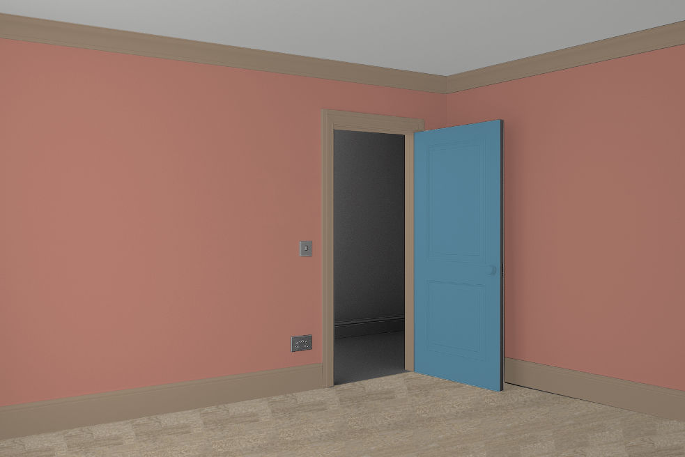
A blue door against a warm orange wall. To some eyes, this looks like high contrast.
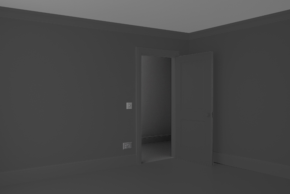
The same view in black and white. The door and wall and floor have no contrast.
To comply with UK Building Regulations, the general requirement is a 30-point difference between the Light Reflectance Values (LRV) of adjacent surfaces.
Calculating this manually across an entire building can be time-consuming due to the complexity of how different elements, walls, floors, doors, and ironmongery, interact.
A good starting point for a compliant scheme:
While not the only solution, many successful inclusive designs follow this baseline:
Ceiling: ~90% LRV
Walls: ~60% LRV
Floors: ~30% LRV
By following this "step-down" approach, you ensure a clear 30-point contrast between each major surface. However, the real challenge often lies in the details, such as ensuring door frames contrast with walls, or that transition strips don't create visual confusion.
According to BS 8300, good visual contrast is defined as an LRV difference of 30 points or more between certain adjacent surfaces.
For example, if your floor has an LRV of 10 and your wall has an LRV of 50, the difference is 40 points. This is a Pass.
We developed our Visual Contrast Design Tool to support designers in this process.
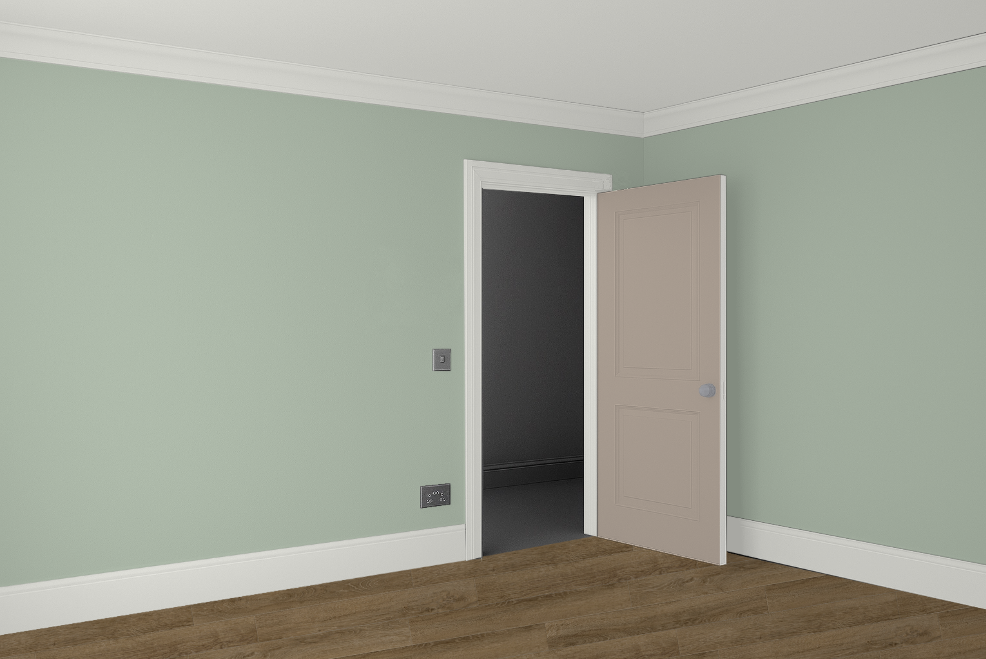
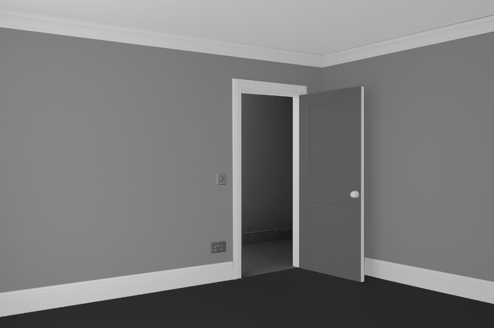
Above is an example of a compliant scheme build using our tool
Room Boundaries:
The floor contrasts clearly with the wall, with a skirting board that highlights the junction.
Navigation:
The door contrasts with the surrounding wall, making the exit easy to locate.
Details:
The door's leading edge and ironmongery contrast with the door face, ensuring the handle is visible to a user with low vision.

